By integrating with GIPHY, the first and largest GIF search engine, you gain free access to our ever-growing content library of GIFs and Stickers, plus brand new features like animated Emoji and Text — featuring the latest in entertainment, sports, and breaking news from GIPHY's official content partners.
The fastest and easiest way to bring the full GIPHY experience directly to your app is with GIPHY SDK. Built with developers and product designers in mind, GIPHY SDK is a top-to-bottom solution for all things GIF in your app. This includes interfacing with GIPHY API, fetching and caching assets, and displaying GIFs and Stickers on screen in customizable UI templates.
With billions of requests a day, it’s safe to say GIPHY knows GIFs. We're excited to share our best-in-class tools with you so your users can have the best GIF experience possible, with all the same features they're already enjoying on Facebook, Slack, Instagram, and more – with just a few lines of code.
Here’s what GIPHY SDK offers:
Our team in NYC designed flexible UI kits for our SDK users, so you can customize your GIPHY integration without any of the hard work. Check them out here!
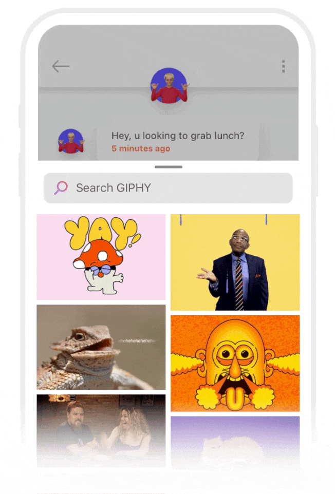
World class movie studios, TV networks, sports leagues, brands, influencers and artists use GIPHY every day to share an enormous library of high quality content with our network.
We offer extensive rendition options for different platforms and devices to ensure loading GIPHY content doesn’t get in the way of your app’s speed.
GIPHY Analytics helps improve your users’ search results and keeps them coming back for more.
GIPHY’s newest content and features, like animated text and emoji, will be available exclusively on the GIPHY SDK, along with all future releases.
Our content is moderated so you can feel secure knowing content served through GIPHY is safe for distribution.
If you're already familiar with our API, you'll be glad to know GIPHY SDK includes all of its best features, but takes a fraction of the time to implement.
Before you get started, head over to our sample app repository for iOS or Android to check out GIPHY SDK in action, along with example code.
At GIPHY, we believe everything should move and it’s part of our mission to help make everyday conversations more animated. With our growing list of content types, expressing yourself with GIPHY has never been easier.
Please note that Emoji and Text, as well as all future releases, are only available through the SDK.
GIFs are short, looping, moving images. Need we say more?
Stickers are GIFs with transparent backgrounds. They’re great for layering animated content on top of all kinds of use cases: messaging apps, stories (e.g., IG, Snap, FB etc.), or games. Basically, any time a square frame just won't do.
GIPHY Emojis are fully animated emoji stickers. No longer are these familiar, emotive faces frozen in place, as GIPHY emoji brings life and motion to some all time favorites, as well as some new (and uniquely GIPHY) emojis.
GIPHY Text features animated text-based stickers, making it easy to add that perfect amount of sarcasm, enthusiasm, or whatever emotion is needed to the conversation.
The GIPHY SDK for iOS is currently only available through Cocoapods, but we still use Github for release notes, issue tracking, and more.
Head over to the example repo to:
pod install
before building the example app.Add the GiphyUISDK to your Podfile like so:
use_frameworks! target "YourAppTarget" do pod 'Giphy' end
Note: for pure Objective-C projects, add an empty swift file to your project and choose Create the Bridging Header
when prompted by Xcode. This allows static libraries to be linked.
Here's a basic ViewController
setup to make sure everything's working:
Copy Codeimport UIKitimport GiphyUISDKimport GiphyCoreSDKclass ViewController: UIViewController {override func viewDidLoad() {super.viewDidLoad()GiphyUISDK.configure(apiKey: "your api key here")}override func viewDidAppear(_ animated: Bool) {super.viewDidAppear(true )present(GiphyViewController(), animated: true, completion: nil)}}
First things first, be sure to import:
Copy Codeimport GiphyUISDKimport GiphyCoreSDK
Configure your API key. Apply for an API key here.
Copy CodeGiphyUISDK.configure(apiKey: "yOuR_kEy_HeRe")
Create a new GiphyViewController
, which takes care of most of the magic.
Copy Codelet giphy = GiphyViewController()
Create a new GiphyViewController
every time you want to show GIPHY (maintaining a reference to the same GiphyViewController
object isn't necesssary and can impact performance and lead to unexpected results)
.dark
or .light
.Copy Codegiphy.theme = .dark
.waterfall
(vertical) or .carousel
(horizontal).Copy Codegiphy.layout = .waterfall
mediaTypeConfig
property, which is an array of GPHContentType
s.Copy Codegiphy.mediaTypeConfig = [.gifs, .stickers, .text, .emoji]
Objective-C:
Copy Code[giphy setMediaConfigWithTypes: [[ NSMutableArray alloc] initWithObjects:@(GPHContentTypeGifs), @(GPHContentTypeStickers), @(GPHContentTypeText), @(GPHContentTypeEmoji), nil ] ];
.waterfall
mode — this property will be ignored if the layout
is .carousel
.Copy Codegiphy.showConfirmationScreen = true
ratedPG13
.Copy Codegiphy.rating = .ratedPG13
fixedWidth
.Copy Codegiphy.renditionType = .fixedWidth
false
will set the language to en
.Copy Codegiphy.shouldLocalizeSearch = false
GiphyViewController
's height. Default 0.7
Copy CodeGiphyViewController.trayHeightMultiplier = 0.7
Present the GiphyViewController
and watch as the GIFs start flowin'.
Copy Codepresent(giphy, animated: true, completion: nil)
Set the delegate and conform to the GiphyDelegate
protocol to handle GIF selection.
Copy Codegiphy.delegate = self
Copy Codeextension YourController: GiphyDelegate {func didSelectMedia(giphyViewController: GiphyViewController, media: GPHMedia)// your user tapped a GIF!}func didDismiss(controller: GiphyViewController?) {// your user dismissed the controller without selecting a GIF.}}
From there, it's up to you to decide what to do with the GIF.
Create a GPHMediaView
to display the media:
Copy Codelet mediaView = GPHMediaView()mediaView.media = media
Use the media's aspectRatio
property to size the view:
Copy Codelet aspectRatio = media.aspectRatio
If you want to build your own view to display a GIF, grab a URL to the asset like so:
Copy Codelet webpURL = media.url(rendition: .original, fileType: .webp)let gifURL = media.url(rendition: .fixedWidth, fileType: .gif)let vidURL = media.url(rendition: .fixedWidth, fileType: .mp4)let url = URL(string: gifURL)
In a messaging app context, you may want to send media id
s rather than GPHMedia
objects or image assets.
Obtain a GPHMedia
's id
property via media.id
On the receiving end, obtain a GPHMedia
from the id
like so:
Copy CodeGiphyCore.shared.gifByID(id) { (response, error) inif let media = response?.data {DispatchQueue.main.sync { [weak self] inself?.mediaView.media = media}}}
We no longer provide button classes GPHGiphyButton
, GPHGifButton
, and GPHContentTypeButton
, however you may still use GPHIcons.giphyLogo()
to obtain a small UIImage
of the GIPHY logo, as we do in the ViewController
of the Swift sample app.
Please download the Sketch file here for a variety of button icon options to open the GIPHY SDK experience.
We use PINCache to cache media assets, which reduces unnecessary image requests and loading times. We create our own instance of PINCache, which you can access via GPHCache.shared.pinCache
.
By default, we use both PINCache’s memory cache and disk cache. The disk cache is limited to 300 mb by default, but you can set to any value you’d like:
Copy Code// set to 300 mbGPHCache.shared.pinCache.diskCache.byteLimit = 300 * 1000 * 1000
If you only want to cache GIFs in memory, set
GPHCache.shared.setting
to memoryOnly
like so:
Copy CodeGPHCache.shared.setting = .memoryOnly
Similarly, you can cache only to disk with:
Copy CodeGPHCache.shared.setting = .diskOnly
Note: We don't automatically clear the cache when the GiphyViewController
is dismissed.
Manually clear the cache on your convenience by calling GPHCache.shared.clear()
to clear the cache based on your setting, or GPHCache.shared.clear(.memoryOnly)
to choose a specific cache you want to clear.
We serve sponsored content every now and then, so we can continue building great products and sharing the joy of GIFs across the Internet and in apps like yours.
As a result, you’ll have to check a few boxes when you submit your app for review on the App Store if you’ve integrated this SDK.
yes
when asked if the app uses an advertising identifier and be sure to check:The GIPHY SDK for Android is currently only available through Maven, but we still use Github for release notes, issue tracking, and more.
Head over to the example repo to:
Add the GIPHY Maven repository to your project's build.gradle
file:
Copy Codemaven {url "http://giphy.bintray.com/giphy-sdk"}
Then add GIPHY SDK dependency in the module build.gradle
file:
implementation 'com.giphy.sdk:ui:1.0.0'
Here is a basic example of how everything should work:
Copy Codeclass GiphyActivity: AppCompatActivity() {override fun onCreate(savedInstanceState: Bundle?) {super.onCreate(savedInstanceState)GiphyCoreUI.configure(this, YOUR_API_KEY)GiphyDialogFragment.newInstance().show(supportFragmentManager, "giphy_dialog")}}
Before you start using GIPHY SDK, you have to initialize it using your GIPHY API KEY. You can apply for an API key here.
Copy CodeGiphyCoreUI.configure(this, YOUR_API_KEY)
All the magic is done by the GiphyDialogFragment
. You can adjust GIPHY SDK by passing a GPHSettings
object when creating the dialog.
Create a settings object to personalize your GIF picker.
Copy Codevar settings = GPHSettings(gridType = GridType.waterfall, theme = LightTheme, dimBackground = true)
Instantiate a GiphyDialogFragment
with the settings object.
Copy Codeval gifsDialog = GiphyDialogFragment.newInstance(settings)
GPHSettings
propertiesDarkTheme
or LightTheme
.Copy Codesettings.theme = LightTheme
.waterfall
(vertical) or .carousel
(horizontal).Copy Codesettings.gridType = GridType.waterfall
mediaTypeConfig
property, which is an array of GPHContentType
objects.Copy Codesettings.mediaTypeConfig = arrayOf(GPHContentType.gif, GPHContentType.sticker, GPHContentType.text, GPHContentType.emoji)
.waterfall
mode - this property will be ignored if the layout
is .carousel
.Copy Codesetting.showConfirmationScreen = true
pg13
.Copy Codesettings.rating = RatingType.pg13
fixedWidth
for the grid and original
for the confirmation screen.Copy Codesettings.renditionType = RenditionType.fixedWidthsettings.confirmationRenditionType = RenditionType.original
Show your GiphyDialogFragment
using the SupportFragmentManager
and watch as the GIFs start flowin'.
Copy CodegifsDialog.show(supportFragmentManager, "gifs_dialog")
To handle GIF selection you need to implement the GifSelectionListener
interface.
Copy CodegiphyDialog.gifSelectionListener = object: GiphyDialogFragment.GifSelectionListener {override fun onGifSelected(media: Media) {//Your user tapped a GIF}override fun onDismissed() {//Your user dismissed the dialog without selecting a GIF}}
From there, it's up to you to decide what to do with the GIF.
Create a GPHMediaView
to display the media. Optionally, you can pass a rendition type to be loaded.
Copy Codeval mediaView = GPHMediaView(context)mediaView.setMedia(media, RenditionType.original)
You can also populate a GPHMediaView
with a media id
like so:
Copy CodemediaView.setMediaWithId(media.id)
There are three button classes provided for you to use if you choose to.
GIPHY branded button available in the following styles:
logo
- full giphy logologoRounded
- same styles as logo
with rounded cornersiconSquare
- square giphy icon logo with black backgroundiconSquareRounded
- same styles as iconSquare
with rounded cornersiconColor
- color version of giphy icon logo with transparent backgroundiconBlack
- solid black version of the giphy icon logo with transparent backgroundiconWhite
- solid white version of the giphy icon logo with transparent backgroundCopy Codeval button = GPHGiphyButton(context)button.style = GPHGiphyButtonStyle.iconBlack
Generic gif button with the text "GIF", available in the following styles:
rectangle
- rectuangular "pill" style button with solid background and transparent textrectangleRounded
- same styles as rectangle
with rounded cornersrectangleOutline
- rectuangluar "pill" style button with solid text and an outlinerectangleOutlineRounded
- same styles as rectangleOutline
with rounded cornerssquare
- same styles as rectangle
but square with smaller textsquareRounded
- same styles as square
with rounded cornerssquareOutline
- same styles as rectangleOutline
but square with smaller textsquareOutlineRounded
- same styles as squareOutline
with rounded cornerstext
- transparent background button with "gif" text onlyThe GPHGifButton
is also available in the following colors:
pink
- pink and purple gradientblue
- blue and purple gradientblack
- solid blackwhite
- solid whiteCopy Codeval button = GPHGifButton(context)button.style = GPHGifButtonStyle.squareRoundedbutton.color = GPHGifButtonColor.blue
Icon buttons for the different supported icon types. These come in the following styles:
stickers
- solid sticker iconstickersOutline
- outline version of the stickers
buttonemoji
- solid emoji smiley iconemojiOutline
- outline version of the emoji
buttontext
- solid text speech bubble icontextOutline
- outline version of the text
buttonThe GPHContentTypeButton
is also available in the following colors:
pink
- pink and purple gradientblue
- blue and purple gradientblack
- solid blackwhite
- solid whiteCopy Codeval button = GPHContentTypeButton(context)button.style = GPHContentTypeButtonStyle.emojibutton.color = GPHGifButtonColor.blue
These instructions pertain to verifying your integration when requesting a production API key
Add and set the verificationMode
parameter to the configure
function like so:
Copy CodeGiphyUISDK.configure(apiKey: "your_api_key", verificationMode: true)
Copy Code[GiphyUISDK configureWithApiKey:@"your_api_key" verificationMode: true];
Copy CodeGiphyCoreUI.configure(context = yourContext, apiKey = "your_api_key", verificationMode = true)
Run your app and your Random ID will be printed to the console. You will need to use this ID to complete the Verify GIPHY Integration step.
We want to make it as easy as possible to seamlessly integrate GIPHY into your app, while respecting your current user experience and interface style. That’s why we’ve done most of the heavy lifting for you! As part of the GIPHY UI SDK, a library of interface assets is provided to streamline your integration process.
We recognize that every app is different, which is why GIPHY SDK offers different layouts, colors, and other customization options to ensure a smooth and consistent experience.
We’ve provided you with two styles of GIF buttons: Branded and Generic. The GIF button activates the SDK and can be placed anywhere in your app. They both work on dark or light backgrounds. The branded GIPHY version has two styles, with squared or rounded corners. The generic button reads ‘GIF’ and comes in various colors: blue or pink gradient, and black or white. We recommend keeping these buttons at a tap size of 35px or more.
The UI SDK offers two main layout options: Waterfall and Carousel. Waterfall layout provides a vertical grid of GIFs on top of your app, while Carousel layout offers a single horizontal carousel of GIFs. Select your layout using .waterfall
(vertical) or .carousel
(horizontal). We also provide two main color themes, Dark and Light, each with its own search interface. To make your selection, set your theme to .dark
or .light
.
Some further customization options include the GIF confirmation screen, which shows a larger rendition of the GIF/Sticker before sharing. This property will be ignored if the layout is .carousel
as the confirmation screen is only available for .waterfall
mode.
GIPHY loves its community and we want to support our GIF and Sticker creators. We believe that they should get recognition for the content they create. That’s why we’ve included a tap and hold UI that shows the creator’s username and enables users to easily search for more content by that creator.
The optional confirmation view mentioned above also includes the creator’s username, if one exists.
Ready to design your GIPHY experience? Download our Sketch UI Kit to drag and drop elements into your app and experiment with layouts, fonts, colors, and content that work best for you.
Download Sketch UI KitWhile we have included a branded button for SDK users, you may need our logo for other purposes. Check out the links below to download GIPHY-approved logos and icons, along with our brand guidelines.
For general best practices related to the GIPHY brand, see our Brand Guidelines and be sure to check out our SDK License Agreement. By using GIPHY SDK, you are agreeing to the SDK License Agreement.